Easy Tech Tuts
How to Overlay 2 Charts in TradingView Easily 2026
By Impran M N
Switching between browser tabs to compare two stocks is slow and makes it hard to see how they actually move relative to each other. TradingView's Compare tool solves this by plotting a second symbol directly on your existing chart, rescaled so both are readable together even when their prices are wildly different — like a $270 stock next to a $190 one. This guide follows the real workflow: opening a base chart, adding a second symbol as an overlay, and adjusting its scale and appearance so the comparison actually tells you something.
01Start from TradingView's markets view
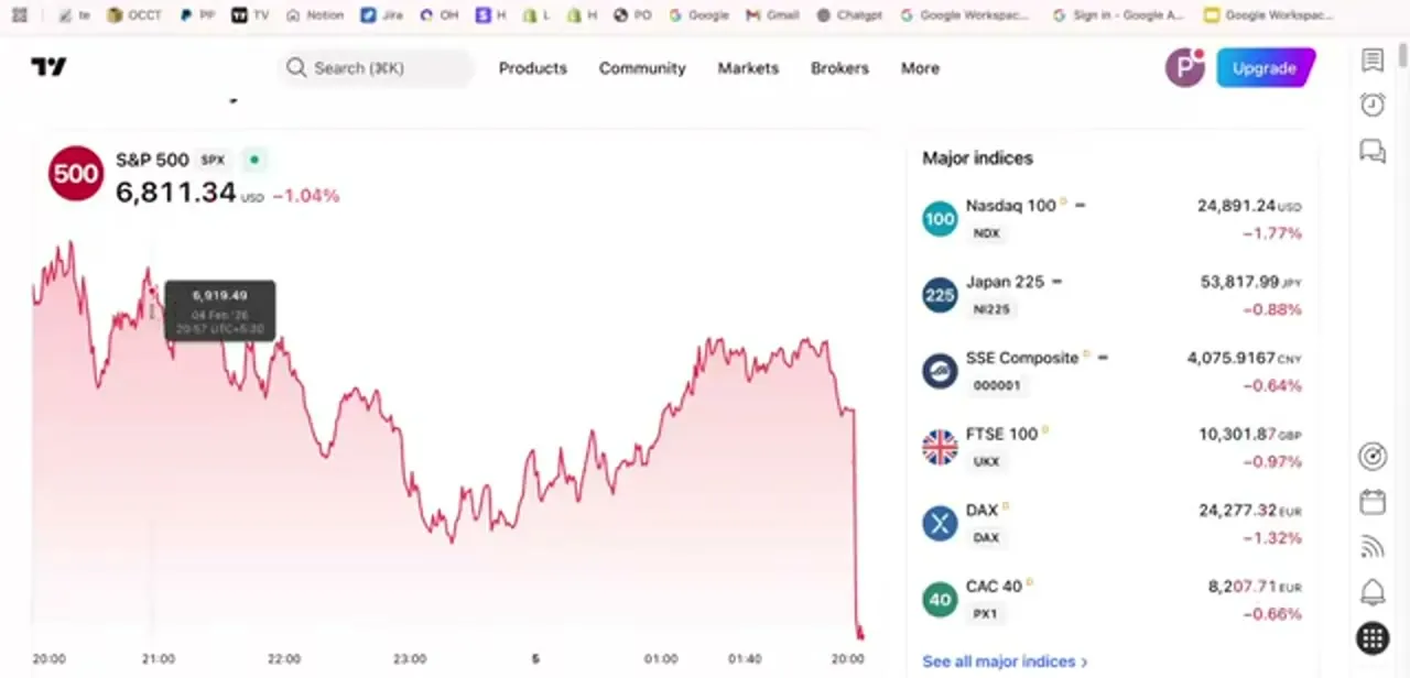
Landing on TradingView, you're typically shown a broad market snapshot — an index chart like the S&P 500 alongside a sidebar of major indices such as the Nasdaq 100, Japan 225, and FTSE 100, each with its current level and percentage move. This overview is useful for spotting which assets are worth comparing before you commit to a chart, but the actual overlay work happens once you open a specific symbol's chart, not from this summary screen.
02Open your base chart
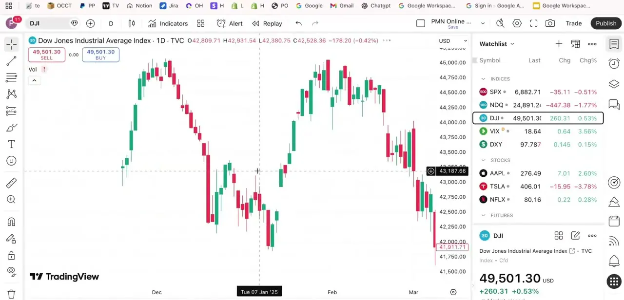
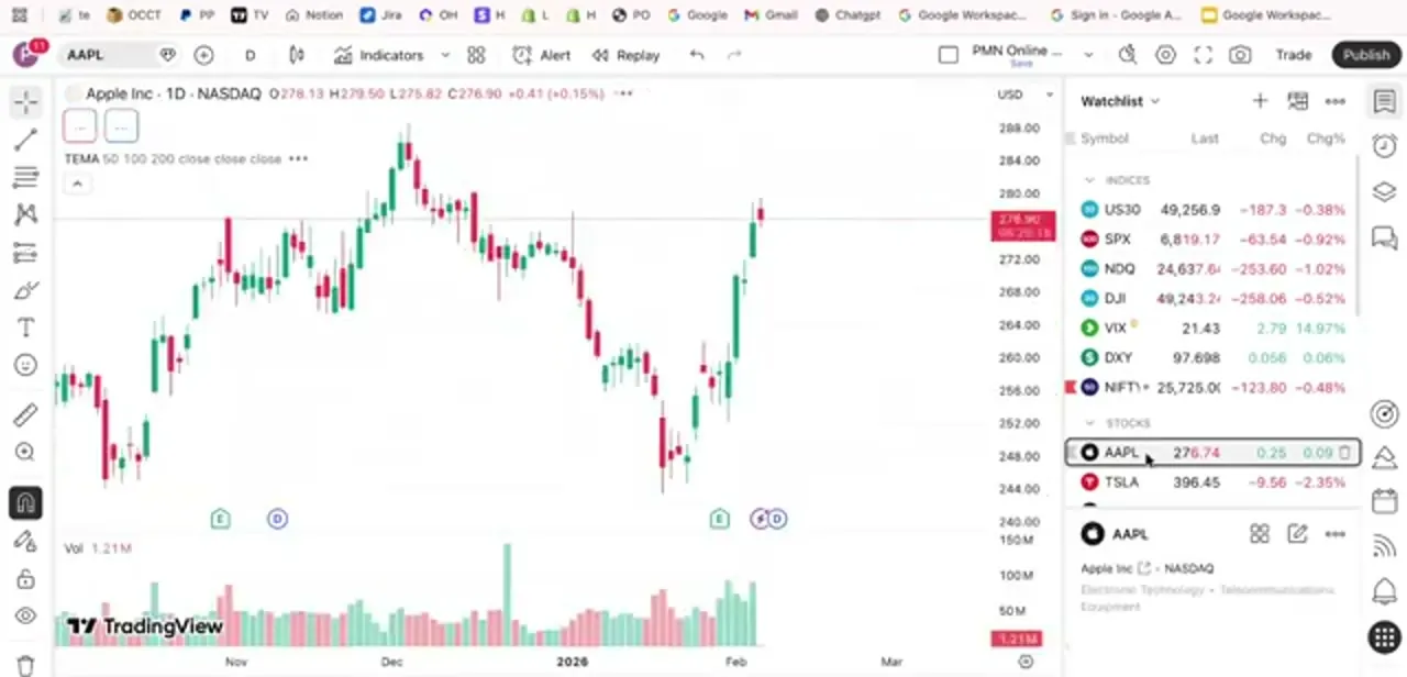
Search for and open the primary symbol you want to compare against — in this workflow, Apple (AAPL) on a 1-day timeframe. The toolbar along the top gives you drawing tools, indicators, and alerts, and the watchlist panel on the right keeps other symbols like the major indices and TSLA visible for quick reference. Add any moving averages or indicators you rely on now, since they'll carry through once you add a second symbol on top.
03Add a second symbol with Compare
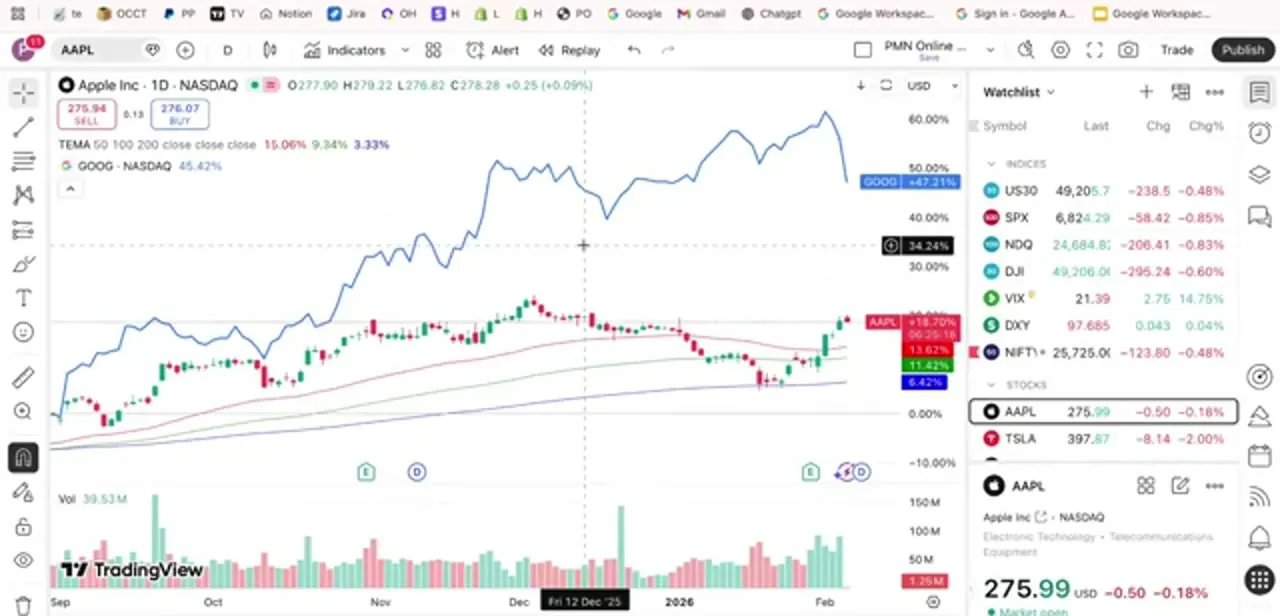
With your base chart open, use the Compare tool to search for and add a second symbol — in this case Google (GOOG) — directly onto the same chart window. TradingView plots it as an overlaid line on its own percentage scale, shown along the right edge from 0% up past 90%, while your original candlesticks stay on their own price scale. The result is two very differently priced assets shown on the same visual plane, with each one's move expressed in percentage terms rather than raw dollars.
04Adjust the overlaid symbol's settings
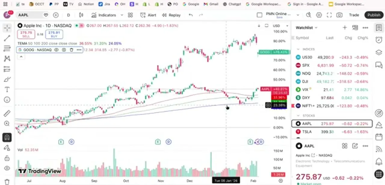
Hover over the compared symbol's label in the top-left legend and a small toolbar appears — an eye icon to toggle visibility, a settings icon to change its line color and style, and a trash icon to remove it entirely. Giving the overlay a distinct color from your candlesticks makes it far easier to track at a glance, especially once you're also watching moving average lines on the same chart.
05Read correlation and relative strength
With both lines on the percentage scale, watching them move together or apart tells you what's happening between the two assets over the selected period. If both climb in step, they're moving with high correlation; when one keeps climbing while the other flattens or drops, that gap is exactly what a relative-strength read is meant to surface. It's a much faster way to answer "which of these two is actually outperforming" than eyeballing two separate price charts.
06Use the same approach across markets
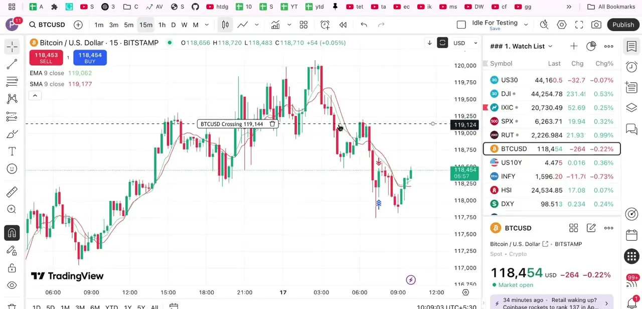
This Compare workflow isn't limited to stocks — the same steps work for comparing crypto pairs, indices, or forex symbols, which is useful when checking whether a coin is moving with or against the broader market, or whether a currency pair is tracking a related index. Once you're comfortable adding and styling one overlay, adding a second or third follows the identical process, though TradingView's own guidance is to keep it to two or three lines before the chart gets too busy to read at a glance.
Frequently asked questions
Can I overlay more than two charts in TradingView?
Yes, you can add multiple symbols using the Compare tool the same way you add the first one, though too many overlaid lines on one chart quickly becomes hard to read.
Does overlaying charts work for crypto and forex too?
Yes, the Compare feature works the same way across stocks, indices, crypto pairs, and forex symbols — you're not limited to one asset class.
Why do my two symbols look on completely different scales?
That's expected when comparing symbols with very different prices. TradingView plots the compared symbol on its own percentage scale by default, shown along the right edge, so both lines read clearly despite the price gap.
How do I change the color of the overlaid line?
Hover over the compared symbol's name in the chart legend and click the settings icon that appears — from there you can change its line color and style to distinguish it from your base chart.
Is overlaying charts available on the free TradingView plan?
The basic Compare/overlay feature is available on TradingView's free plan, though some advanced comparison and indicator tools are reserved for paid tiers.
About the author

Impran M N
I've been hooked on technology for as long as I can remember — especially the new tools and AI apps that seem to land every other week. Easy Tech Tuts is where I write up whatever I've just worked out: I do the task in the real product, record the screen, and turn it into the guide I wish I'd found first.