 Easy Tech Tuts
How to Make Container Full Width in Elementor Easily 2026
By Impran M N
A container that refuses to stretch full width despite looking correctly configured is one of the most common Elementor frustrations, and it's almost always caused by one of two things: the container's own width setting, or a site-wide content width value overriding it from Site Settings. This guide walks through both, using the exact panels Elementor shows you, so you can tell which one is actually boxing in your layout instead of guessing and toggling settings at random.
01Open the container in the Elementor editor
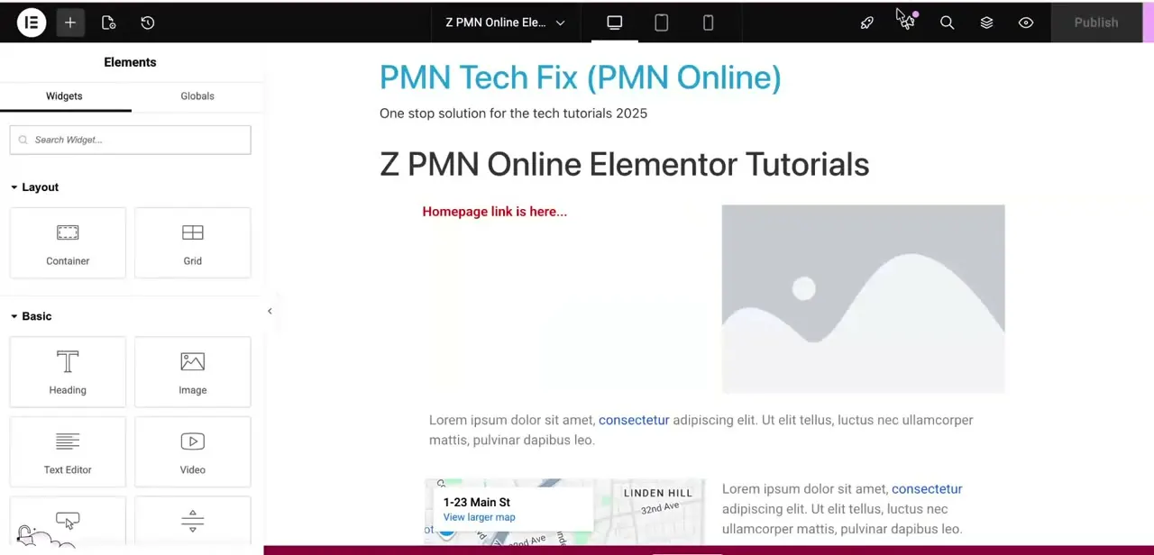
Edit the page and select the container you want to stretch, either by clicking its edge directly on the canvas or picking it from the navigator panel. The left-hand Widgets panel shows your available elements grouped under Layout, Basic, and so on — Container and Grid sit at the top, which is your reminder that in current Elementor versions, containers replaced the old Section/Column structure entirely. Confirm you're editing the actual outer container and not a nested one inside it, since a full-width outer container with a boxed child inside will still look constrained.
02Set Content Width to Full and check the width value
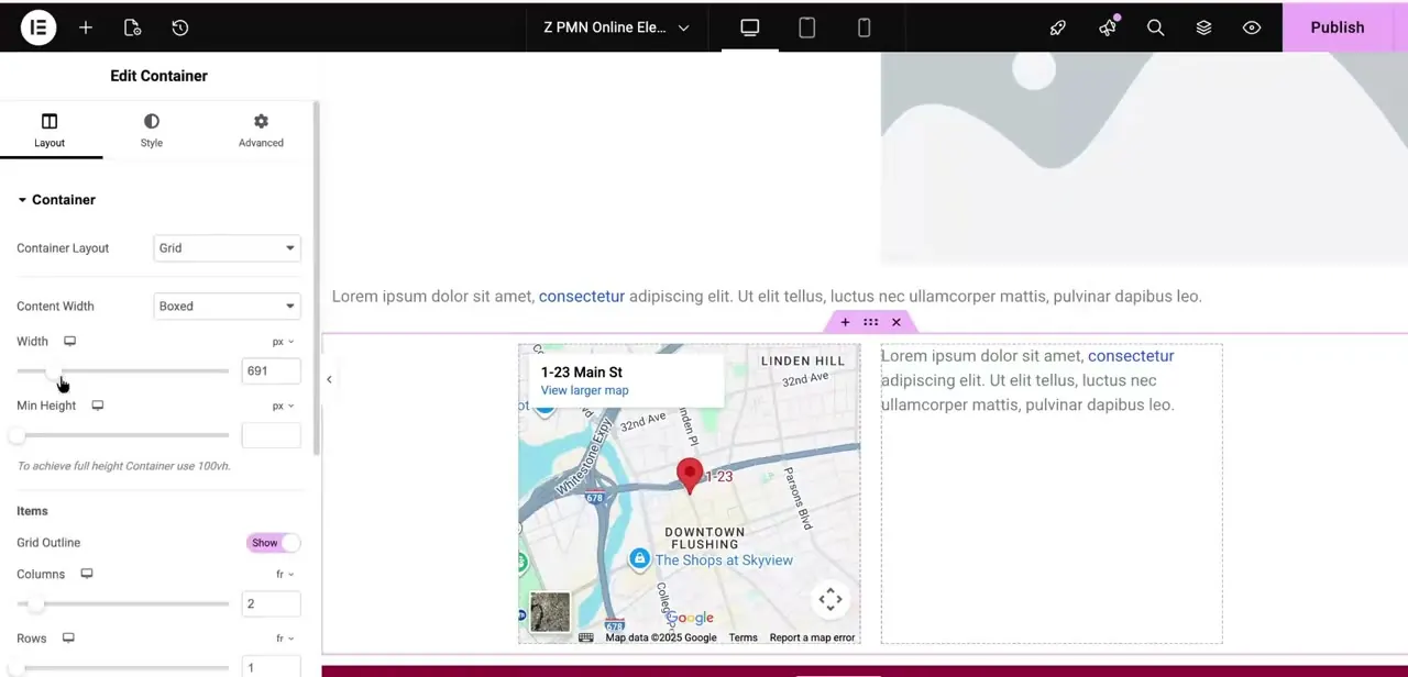
With the container selected, open its Layout tab in the left panel. The Content Width dropdown is the single most important setting here — if it reads "Boxed," the container is capped at a fixed pixel width no matter what else you change, and that's very likely why it looks constrained.
Switch it to "Full" and the container should immediately expand to the edges of the viewport. If a Width field is still showing a specific pixel value underneath, that value only applies in Boxed mode, so don't worry about clearing it once you've switched to Full.
03Remove padding and margin restrictions
Switch to the Advanced tab on the same container and check Padding and Margin under the Space section. Even a full-width container can look boxed if it's carrying large left and right padding values, since that padding eats into the visible width without changing the container's actual boundary. Zero these out or reduce them if you want the content to reach genuinely close to the screen edge, keeping in mind that a small amount of horizontal padding is often intentional so text doesn't touch the very edge of the browser.
04Check the site-wide Content Width in Site Settings
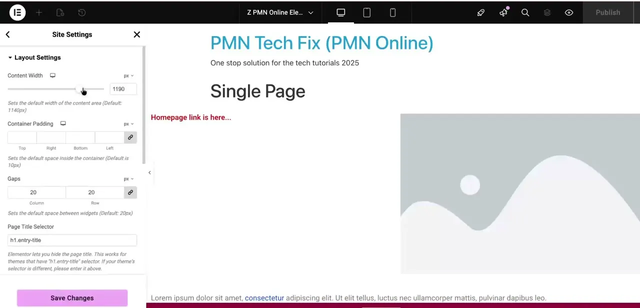
If an individual container is set to Full but still looks boxed, the cause is often global rather than local. Open Site Settings from the hamburger menu, then Layout Settings, and look at Content Width — this value, 1140px by default, sets the width of the content area across your whole site and can visually cap containers that don't explicitly override it. Raising this number, or confirming it isn't accidentally set low, resolves a boxed appearance that no amount of per-container tweaking fixes, because the constraint was never on the container to begin with.
05Rule out theme-level width restrictions
Some WordPress themes — particularly older ones not built around Elementor's container system — apply their own max-width CSS to the page wrapper outside of Elementor's control entirely. If Content Width is set to Full at both the container and site level and the layout is still boxed, check your active theme's own layout or customizer settings for a content width or page width option. Themes like Astra, OceanWP, and GeneratePress expose this in their own settings panel, and it can silently override anything Elementor is doing.
06Confirm the fix on desktop and mobile
Full width settings can behave differently across Elementor's responsive breakpoints, so switch the editor's device preview to tablet and mobile before calling it done. It's common for a container to be genuinely full width on desktop but revert to a smaller max-width on mobile if a breakpoint-specific override was set at some point. Publish the page and reload it in an actual browser window too, since the editor's preview frame doesn't always match real rendering pixel-for-pixel, especially with padding and viewport units.
Frequently asked questions
Why is my Elementor container still boxed after setting it to full width?
Check three places: the container's own Content Width dropdown (Layout tab), the site-wide Content Width under Site Settings → Layout Settings, and your active theme's own width setting, since any one of the three can override the others.
Does full width work differently on mobile?
Yes — full width settings can be overridden by a responsive breakpoint set at some point in the container's Advanced tab, so check the container's appearance separately in the editor's tablet and mobile preview modes.
Is this feature available in Elementor's free version?
Yes, the Content Width dropdown and container layout system are core Elementor functionality available on the free plan, not a Pro-only feature.
Can padding make a full-width container look boxed?
Yes. A container set to Content Width: Full can still look constrained if it carries large left/right padding in its Advanced tab — that padding eats into the visible width even though the container boundary itself is full width.
Can a theme override Elementor's full width setting?
Yes, particularly older themes not built for Elementor's container system, which apply their own max-width CSS to the page wrapper. Check the theme's own layout or customizer settings if Elementor's own settings don't fix it.
About the author

Impran M N
I've been hooked on technology for as long as I can remember — especially the new tools and AI apps that seem to land every other week. Easy Tech Tuts is where I write up whatever I've just worked out: I do the task in the real product, record the screen, and turn it into the guide I wish I'd found first.