Easy Tech Tuts
How to Create Reports in Airtable Easily 2026
By Impran M N
Airtable doesn't hand you a single "Reports" button — visual reporting is spread across grid-level grouping and sorting, plus a set of extensions in the Marketplace that turn raw records into charts, pivot tables, and other summaries. This guide covers structuring your data so it's report-ready, opening the Extensions Marketplace to find the right visualization tool, and one detail that trips people up: several of the most useful reporting extensions, including the Chart app, require a paid plan rather than working on Airtable's free tier.
01Group and sort your grid first
Before adding any visual extension, get your underlying data into shape using the grid view's own tools — Group to cluster records by a field like status or category, Sort to order them predictably, and Filter to cut the view down to what actually belongs in the report. Any chart or pivot extension you add later reads directly from this structure, so a messy, ungrouped grid produces a messy report no matter how good the visualization tool is.
02Open the Extensions Marketplace
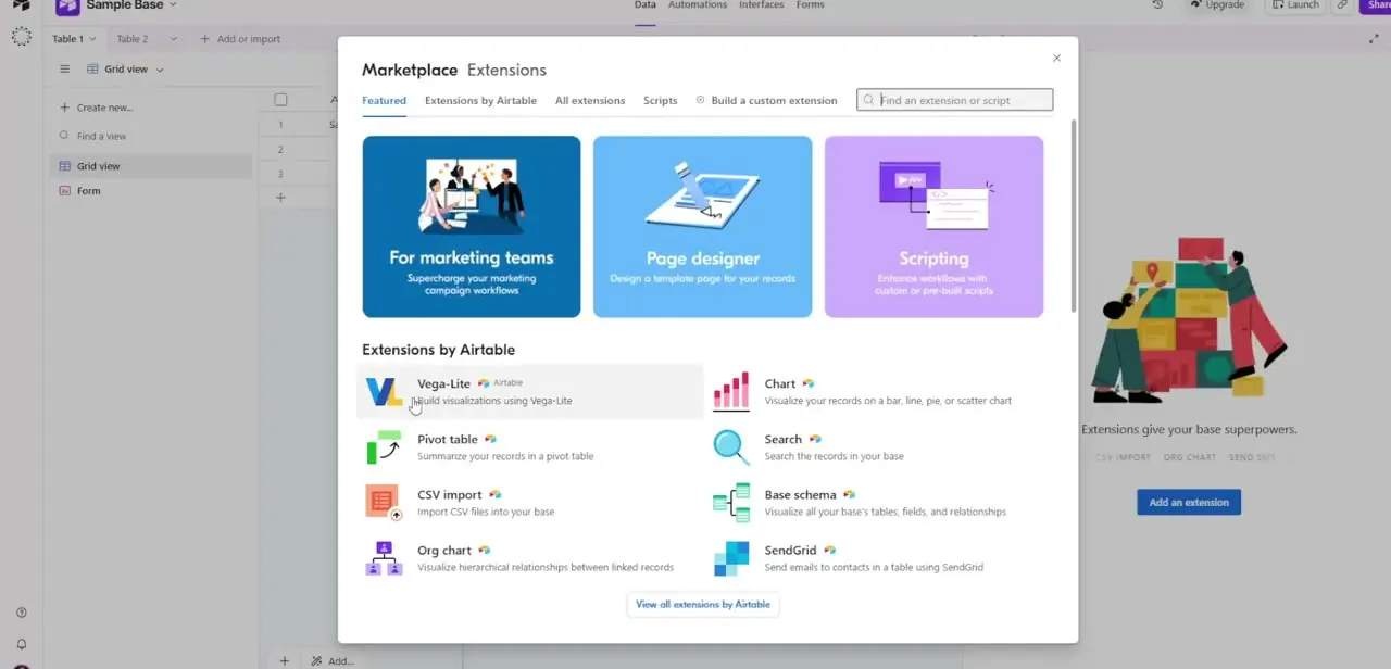
With your table open, look for the Extensions or Marketplace option (often reached through an icon in the toolbar or a dedicated panel) to bring up the Marketplace Extensions modal. It opens on a Featured tab with broad categories like "For marketing teams" and "Page designer," then lists specific extensions by Airtable underneath: Vega-Lite, Chart, Pivot table, CSV import, Search, Base schema, Org chart, and SendGrid among them.
03Pick Chart or Pivot table for reporting
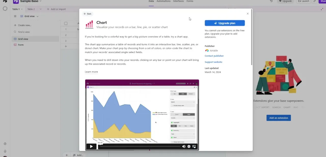
Of the extensions listed, Chart and Pivot table are the two built specifically for reporting. Chart turns a table of records into an interactive bar, line, scatter, pie, or donut chart, with the option to color-code by a single-select field and click into any bar or point to jump to its underlying records. Pivot table summarizes records the way a spreadsheet pivot does — grouped and aggregated across two dimensions — which suits a report with more than one variable to break down at once.
04Check your plan before you commit to one
Click into the Chart extension's detail page and you'll see a preview video of it in action alongside publisher and support information — but also, on a Free-plan account, an "Upgrade plan" prompt explaining that extensions aren't available until you move to a paid tier. This is worth checking before you build a reporting workflow around any specific extension, since discovering the limitation after your data is already structured around it is a frustrating way to find out.
05Add the extension and connect your data
Once you're on a plan that supports extensions, adding one drops a configurable panel alongside your grid. Point it at the table or view holding your grouped data, choose your chart type or pivot dimensions, and pick which fields feed the x-axis, y-axis, and any aggregation like sum, count, or average. The extension updates live as the underlying records change, so it stays accurate without manual refreshing.
06Share the result with your team
Extensions live inside the base itself, so anyone with access to that base and view can see the chart or pivot table alongside the data it summarizes. If you need a cleaner, standalone report page for people outside your working base — something closer to a dashboard than a panel next to a grid — that's what Airtable's separate Interface Designer is built for, on plans where it's included, and it's worth exploring once the underlying grouped data and extension-based report are both working correctly.
Frequently asked questions
Do I need a specific Airtable plan to use reporting extensions?
Yes. Extensions like Chart and Pivot table are not available on Airtable's Free plan — you'll see an "Upgrade plan" prompt when you try to add one, so check your current tier first.
What's the difference between the Chart extension and Pivot table extension?
Chart turns your records into a visual bar, line, pie, scatter, or donut chart you can click into for detail. Pivot table summarizes and aggregates records across two dimensions, closer to a spreadsheet pivot, which suits reports with more than one variable.
Can I click into a chart to see the underlying records?
Yes, clicking on any bar or point in the Chart extension brings up the specific record or records behind that data point.
Does grouping my grid view affect what an extension can report on?
Yes — extensions read from the view you point them at, so grouping, sorting, and filtering that view first gives the extension cleaner, more relevant data to summarize.
Is there a way to build a standalone report page instead of a chart panel next to my grid?
Airtable's Interface Designer is built for that — a dedicated report or dashboard page separate from the grid — but like extensions, its availability depends on your plan.
About the author

Impran M N
I've been hooked on technology for as long as I can remember — especially the new tools and AI apps that seem to land every other week. Easy Tech Tuts is where I write up whatever I've just worked out: I do the task in the real product, record the screen, and turn it into the guide I wish I'd found first.